Everything stays different. That’s actually always the case, though at the moment it is especially true for the automotive world. The car, and the entire automobile industry, has to reinvent itself because the mobility of the future is characterized by new expectations, parameters and options.
What role will design play in all this? Will design-oriented companies have an advantage?
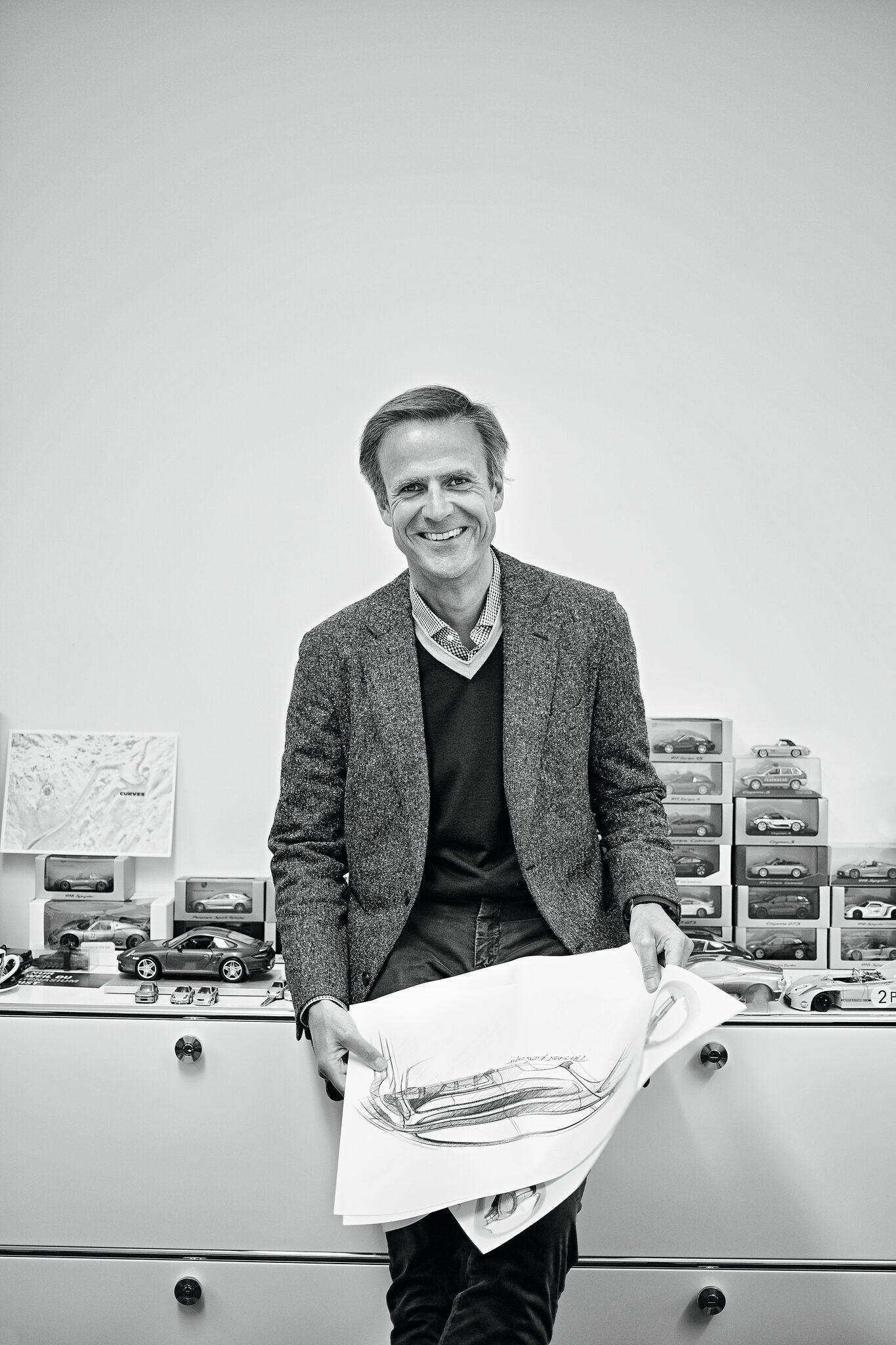
We asked Michael Mauer, the top designer in the Porsche world.
How do designers see the future? As a challenge, a black box, a playing field?
Shaping the future and bringing visions, ideas and innovations to life is one of our fundamental tasks. With showcars, for example. The job of designers is to create hope, fire the imagination, and point the way to the future. We make it possible to relate to and interact with technological progress.
Looking to the future, do you have respect for what lies ahead for the automobile?
We designers see our job as involving an enormous responsibility for the financial well-being of the companies we work for. For this reason, we approach our tasks with a great deal of professional respect. At the same time, we also take pleasure in the challenges and options that present themselves in an ever greater variety for an attractive and desirable future in the field of mobility. As designers, we are already giving this future its form. That’s the good news. The bad news is that we have to lay the groundwork early on, especially in the automobile industry. And we must be aware of the fact that, in the future, successful brands will be the ones that recognize customer needs quickly and create answers using aesthetically sophisticated and innovative product experiences. It’s about progress as an open process.
How important is creativity in all this?
It is the key to innovation. Creativity enables us to combine unknown, novel ideas and to realize new solutions and paradigm shifts. However, creativity does not only live from new, courageous views. Above all, it is the joy of designing, of creating constructive order on a functional and aesthetic level.
So innovation is becoming a matter for design?
A prerequisite for innovation is thinking in terms of realities and possibilities. Designers are trained to do this. They can think both divergently and convergently, are unconventional lateral thinkers as well as straight-line thinkers with clear objectives all rolled into one. In principle, designers are concerned with creatively mixing the given, anticipating the accidental, and so making ideal use of the ability to combine and improvise. Designers work very rationally on the one hand – and at the same time they are endowed with a strong gut feeling.
How important, ultimately, is such an intuitive gut feeling? Isn’t that a bit vague?
Intuition, of course, like any judgment about reality, must be described and critically scrutinized in various dimensions. Modern science understands intuition as a very reliable source of understanding or cognition that is available to us without conscious reasoning and enables us to make perceptual judgments and decisions “from the gut” especially in complex decision-making situations. Intuition is therefore an integrative gut feeling that the human brain has developed in its long evolutionary history in order to evaluate significant matters at lightning speed and to act with confidence. A distinction must also be made between elementary and intelligent intuition. Elementary intuition acts as an automated and thus unconscious information-processing process, without paying much attention to the challenge at hand – for example, when riding a bicycle on uneven terrain. So-called intelligent intuition, on the other hand, is based on the condensed resonance of our entire wealth of experience, including our perceived identity and our perceived values. Intuition, then, in this case, is knowledge based on experience and acquired in direct contact with what is perceived. The strength of this intelligent intuition lies in its depth. It draws from the continuous contact with things and from all experiences . . .
. . . and so always enables an intuitive sense of good design. But why do we all respond to good design in the first place?
Every form has an effect on us – whether we want it to or not. We sort all impressions into positive and negative. Because we experience beautiful things positively, they trigger feelings of pleasure. It’s as simple as that.
Does that alone explain the importance we give to design?
That is only one aspect. Through their design, things tell us what they are and what they can do. Form and design start a film going in our heads. Design doesn’t just mean that products are nice to look at. It is a philosophy, and good design translates into enjoyment of the product thanks to the perfect synthesis of aesthetics, usability, innovation, and a consistently good experience. The designer has to bring the bigger picture into view here. He is the first point of contact where all aspects of a new product come together. This is another reason why the ability to classify holistically is indispensable – always, of course, in direct relation to the brand and its values.
So good design is more important for brands than ever?
Exactly. When you buy an iPhone or a VW, you’re not just buying a phone or a car, you’re making a statement and becoming part of a community. Automotive brands have always sold experiences, not products. The feeling of freedom, power, strength. It’s just that in the future, cars will become more and more alike technically and their technologies more and more complex. For a consistent and differentiated product and brand experience, we need designers more than ever. Design has a signaling effect, it creates identity, becomes a surface upon which to interact. For both products and brands. A visual, tactile, sensual experience. Design makes the -difference.
The question still remains how companies like Apple manage to consistently impress with a good design and product experience, over and over again.
These companies are all about design. They have a design-first culture. At Apple, for example, only two criteria count: simplicity and ease of use. The designer’s job is to combine the two and bring them together in a solution. And in the end, that makes the whole product more successful. That’s how these companies exceed their users’ expectations. The intuitive, pleasantly surprising and consistently enjoyable experience becomes the guiding principle. Every perceptual detail, no matter how small, is consistently polished with this in mind. It’s the user experience that counts.
Is this sort of thinking limited to the product world?
Apple’s chief designer, Jonathan Ive, was asked to design the entire brand world so that everything fits together coherently as part of an overall experience, from the product to the advertising, from the stores to the packaging. And it works, as we all know.
Does it always work?
Successful fashion and luxury companies have practiced this for a long time. They offer extremely strong brand and product worlds with their uniform perceptual experiences. The products are actually quite similar. Differentiation thrives on the consistent design of all brand and product experiences. The creative directors of the fashion and luxury brands have internalized their user experience task as a way to create experience and emotion.
Does that also apply to the world of mobility?
This inevitably will shape the future of the automotive world with its highly emotional products. Especially brands with a premium positioning use this kind of philosophy to their advantage – design becomes the key to success. Design works and functions in contexts. Like all objects and concepts created by people for people, design always develops in a holistic process. We consciously use this for our Future Centers, where vehicle design and user experience design work interdisciplinarily and hand in hand on future mobility concepts.
What provides guidance here?
Basically, you always work out some principles. But these should really only be understood as general guidance. They always have to be, shall I say, updateable. I adapt these principles on a case-by-case basis. I’m talking mainly about trends that lend themselves to being picked up, or trends that I myself would like to develop and shape for my tasks. I think of these principles as a compass, not a navigation system. The compass gives you a rough direction, a navigation system tells you exactly where to turn. But that’s exactly what it’s not supposed to be.
So what does a modern understanding of good design thrive on?
Disciplined, structured, goal-oriented hard work. In other words: brand work. Fundamental skills, sharpened talents, reflected intuition and an intense life in the themes and contexts of the design world are basic conditions for a designer. Psychologists attest to a good designer’s ability to anticipate, just as well-trained athletes do under competitive conditions. All of a sudden, you just know what’s right. Or as fellow designer Gorden Wagener once said in an interview with ramp: “At the end of the day, it’s just ‘that feeling’.”
rampstyle #26
Two thin ovals far up inside a circle, a curved arc below, sketched on sunny yellow. In a split second, our brain has combined the elements into a smiling face, instantly putting us in a good mood. Wonderful! A smiley like that just feels good.
The smiley was invented twice: once in 1963 by Harvey Ball, a graphic designer and advertising expert, who was commissioned by a U.S. insurance company to create something to motivate its employees. The company paid $45 for it, but Ball never had the idea of applying for trademark protection. Franklin Loufrani, a French management consultant, was more enterprising. He placed his smiley in the newspaper »France Soir« in 1972 as an indication of good news and had it legally protected. So much for the first round of inventions. We owe the second invention to Scott Fahlman. The professor of computer science wrote on the Carnegie Mellon University electronic discussion forum on September 19, 1982: »“I propose the following character sequence for joke markers: :-). Read it sideways.« It was probably the ten silliest minutes of his life, Scott Fahlman revealed extremely gleefully in conversation. So let’s take note right here: Just ten minutes of silliness can make the world a happier place.
With this in mind, we wish you a lot of fun!
Interview: Michael Köckritz for ramp
Photos: © Elias Hassos

