At the beginning of the 1970s, advertising came to motorsport, or rather to racing cars. Of course, Formula 1 was the first racing series that was discovered by the big companies to sell their products. But it wasn’t just about selling, it was also about conveying the philosophy or attitude to the lifestyle behind a product.
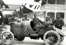
In the 1950s, Grand Prix racing cars were still painted in the colors of their country of origin, red for Italy, blue for France, green for England and silver for Germany. in the 1960s, one or the other sticker from suppliers was put on the racing cars. At that time, Formula 1 and all motor racing did not yet have the radiance of the upcoming stars, in short, the scene was not yet sexy.
Only with the appearance of charismatic drivers like Sir Jackie Stewart and above all Jochen Rindt with his extravagant and beautiful wife Nina changed the attitude to motor racing massively.
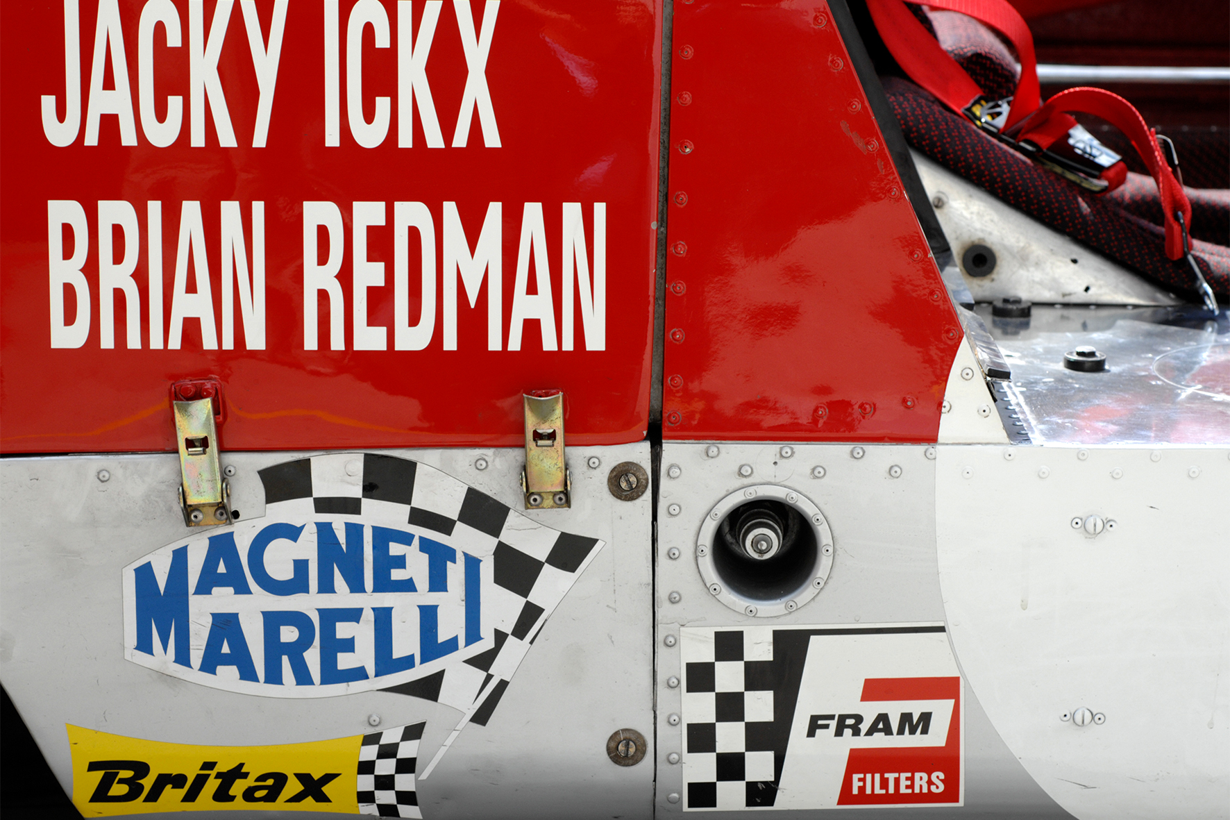
The racing drivers were no longer the lonely, sometimes taciturn heroes, no, they were almost rock stars and, with their extroverted manner, many adorned the front page of the boulevard magazines.
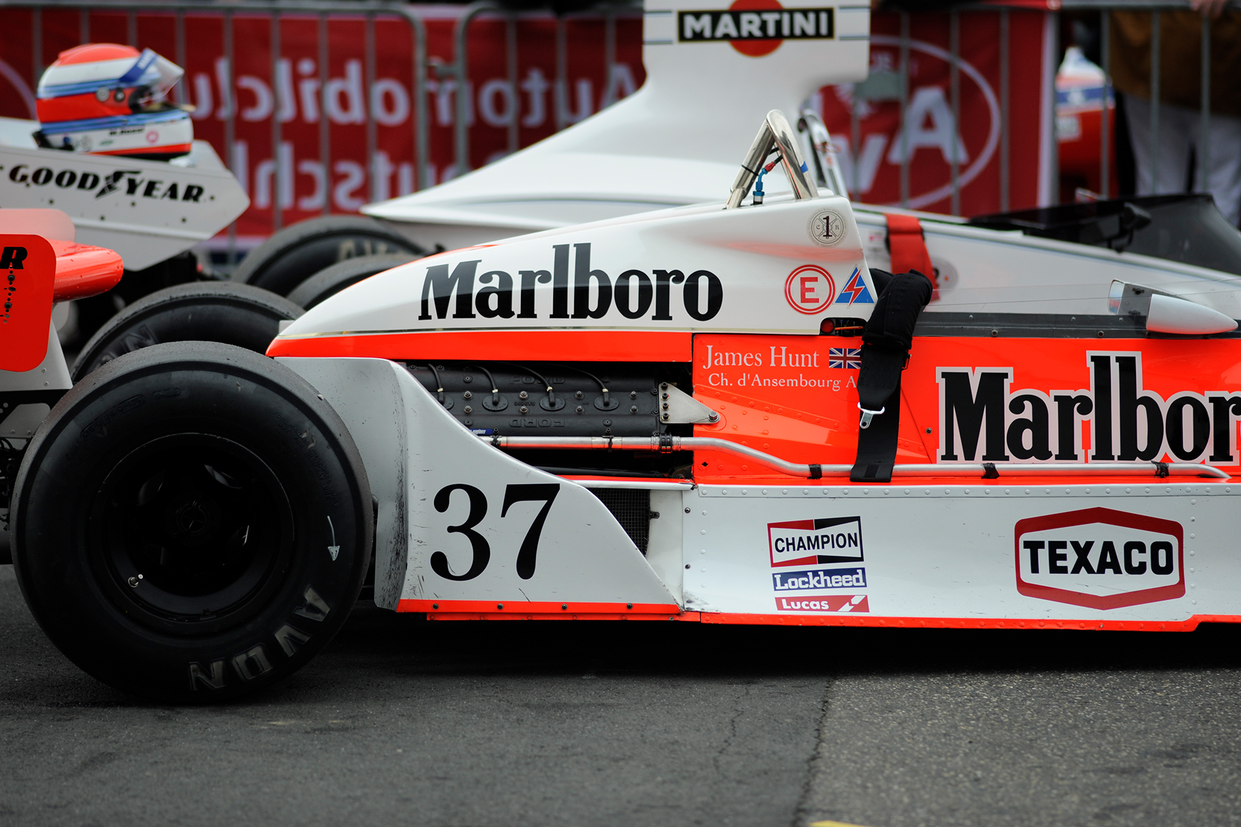
Above all, cigarette advertising
Jochen Rindt and his wife Nina were a real glamor couple. Formula 1 in particular, but also racing as a whole, became socially acceptable and thus also appealing for global companies, especially cigarette advertising.
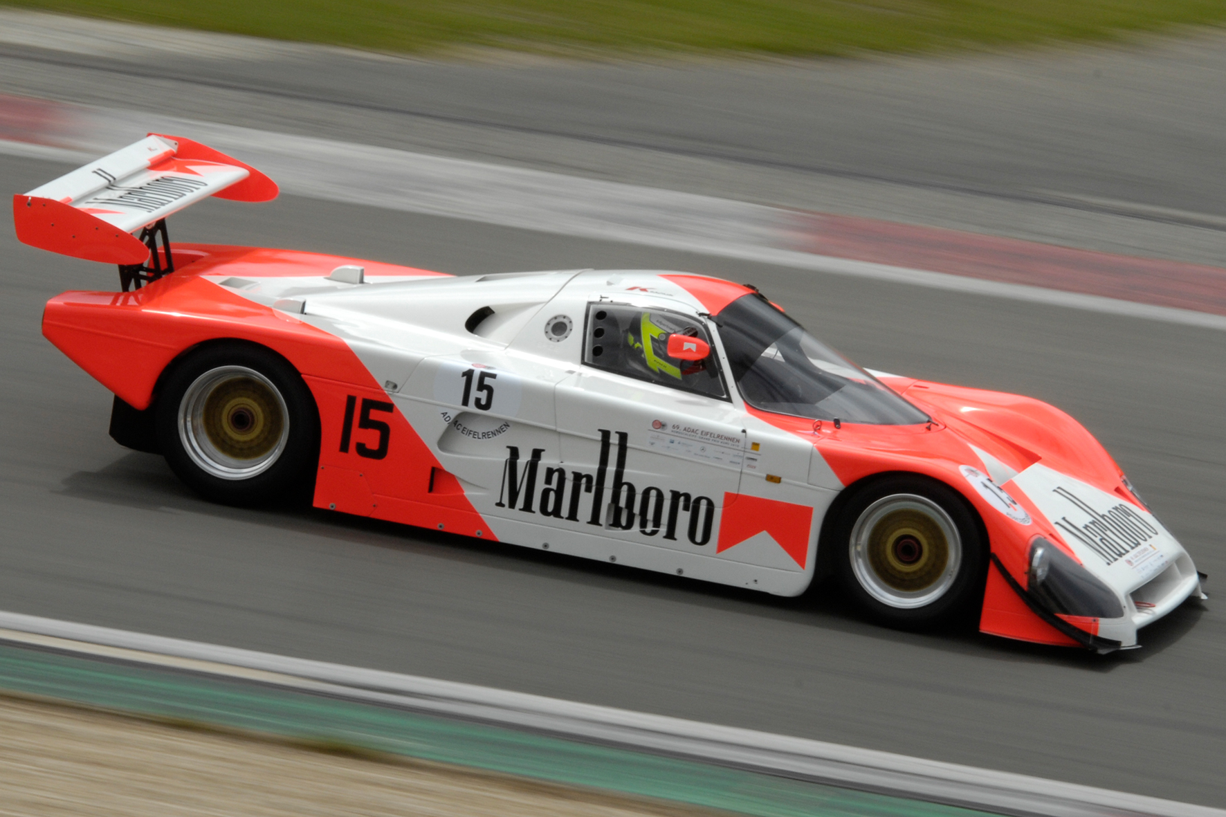
So it is hardly surprising that on the Lotus F1 racing car of the 1970 season, where Jochen Rindt was the works driver, a cigarette advertisement appeared for the first time, Gold Leaf Cigarettes. Even the holy green intended for British racing cars had to be abandoned.
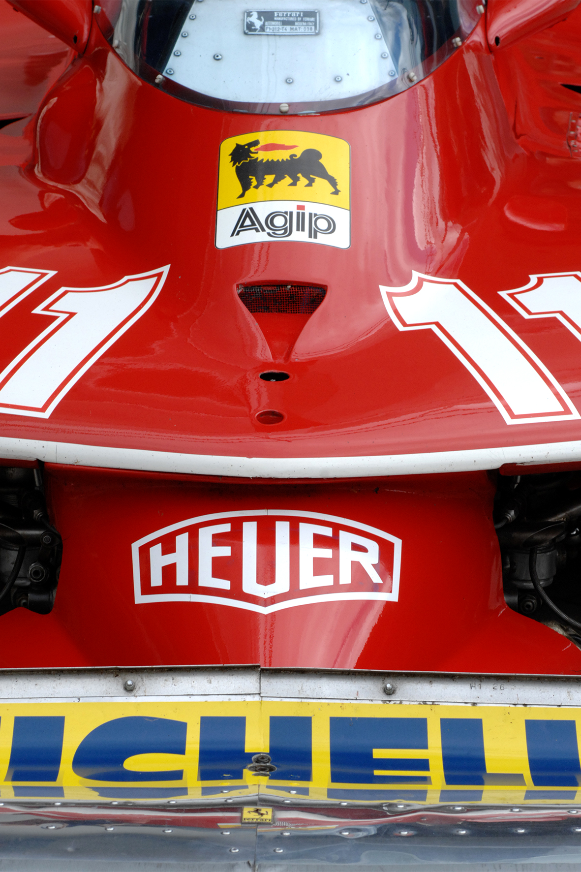
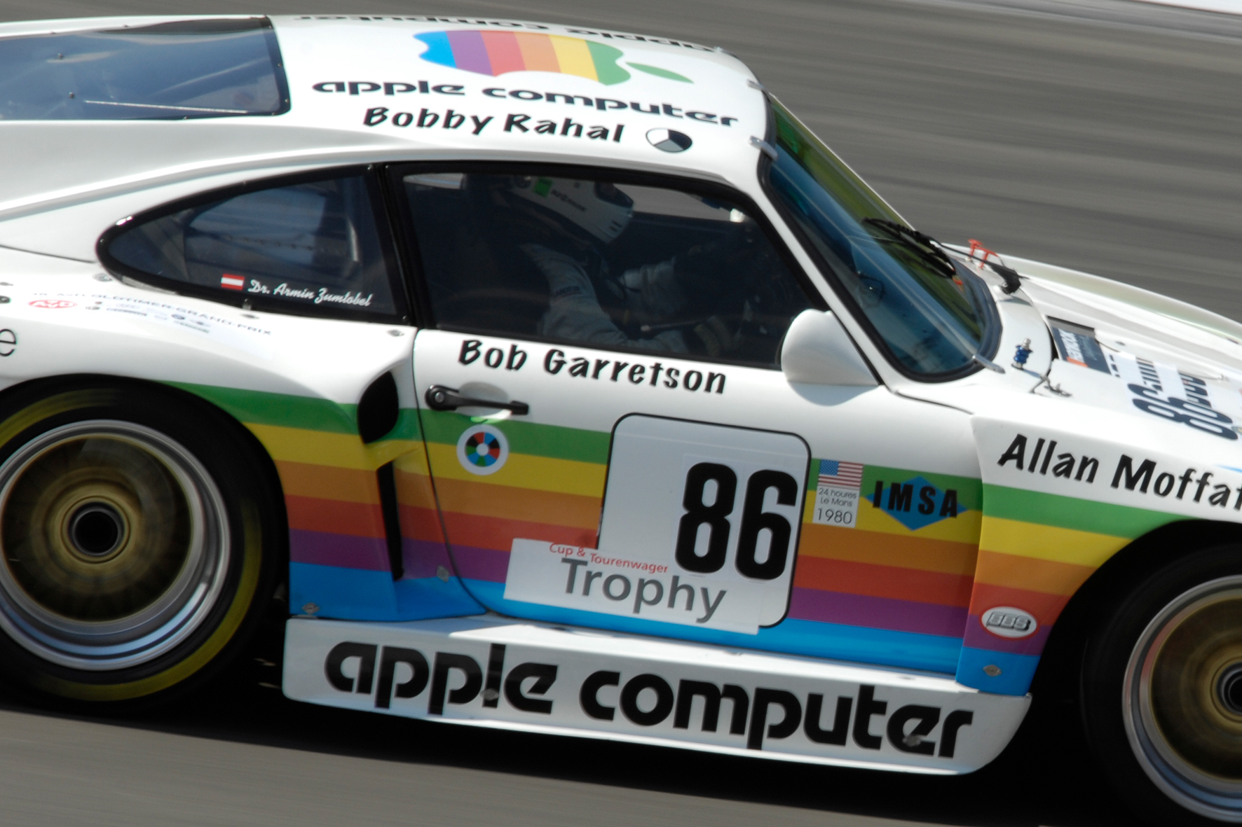
A lot has happened since then, a lot has developed and the advertising industry has completely taken over the racing car body. Today, neither the start numbers nor the driver names are clearly recognizable from the whole tangle of typography.
Like it or not, it is what it is today. Motor sports have become so expensive that the racing teams urgently need this additional income.
Whenever I’m at historic motorsport events and photograph racing cars from different angles, the development of advertising on racing cars always catches my eye.
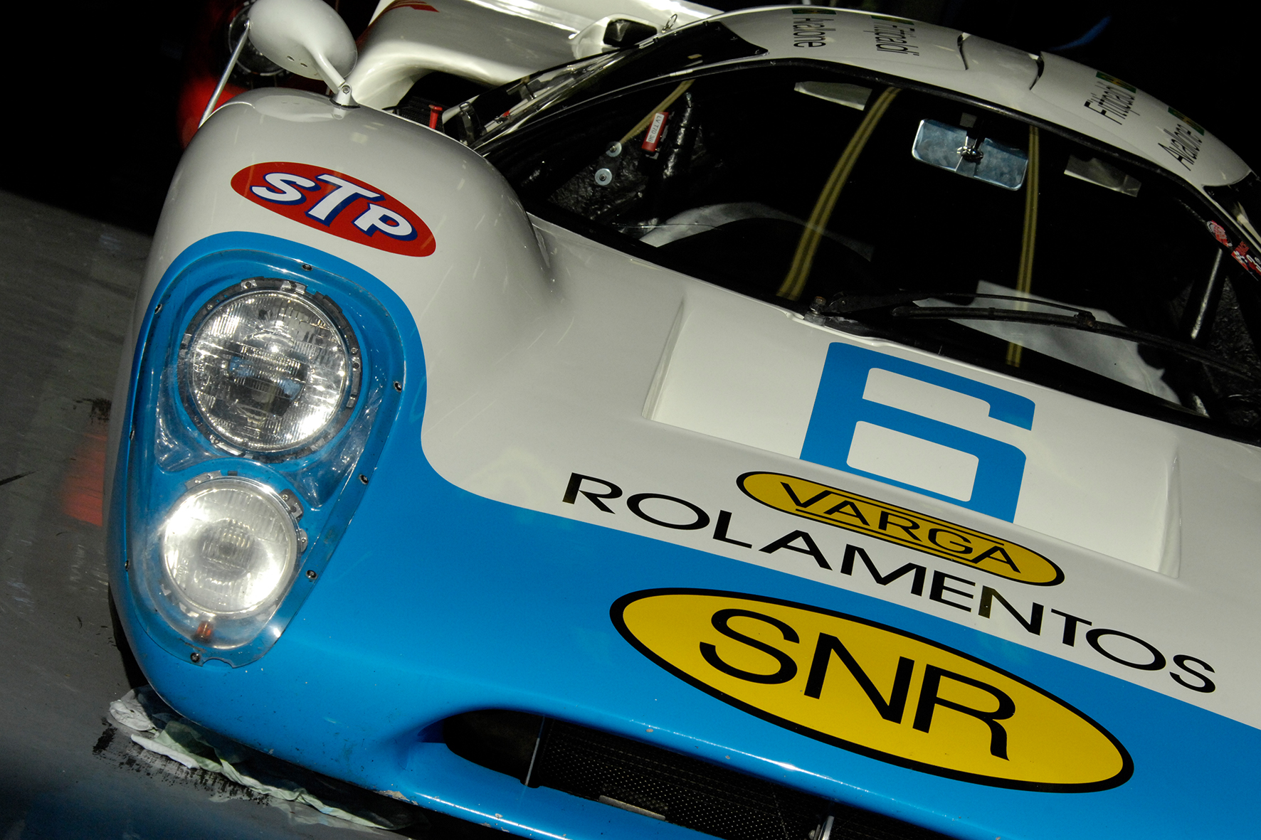
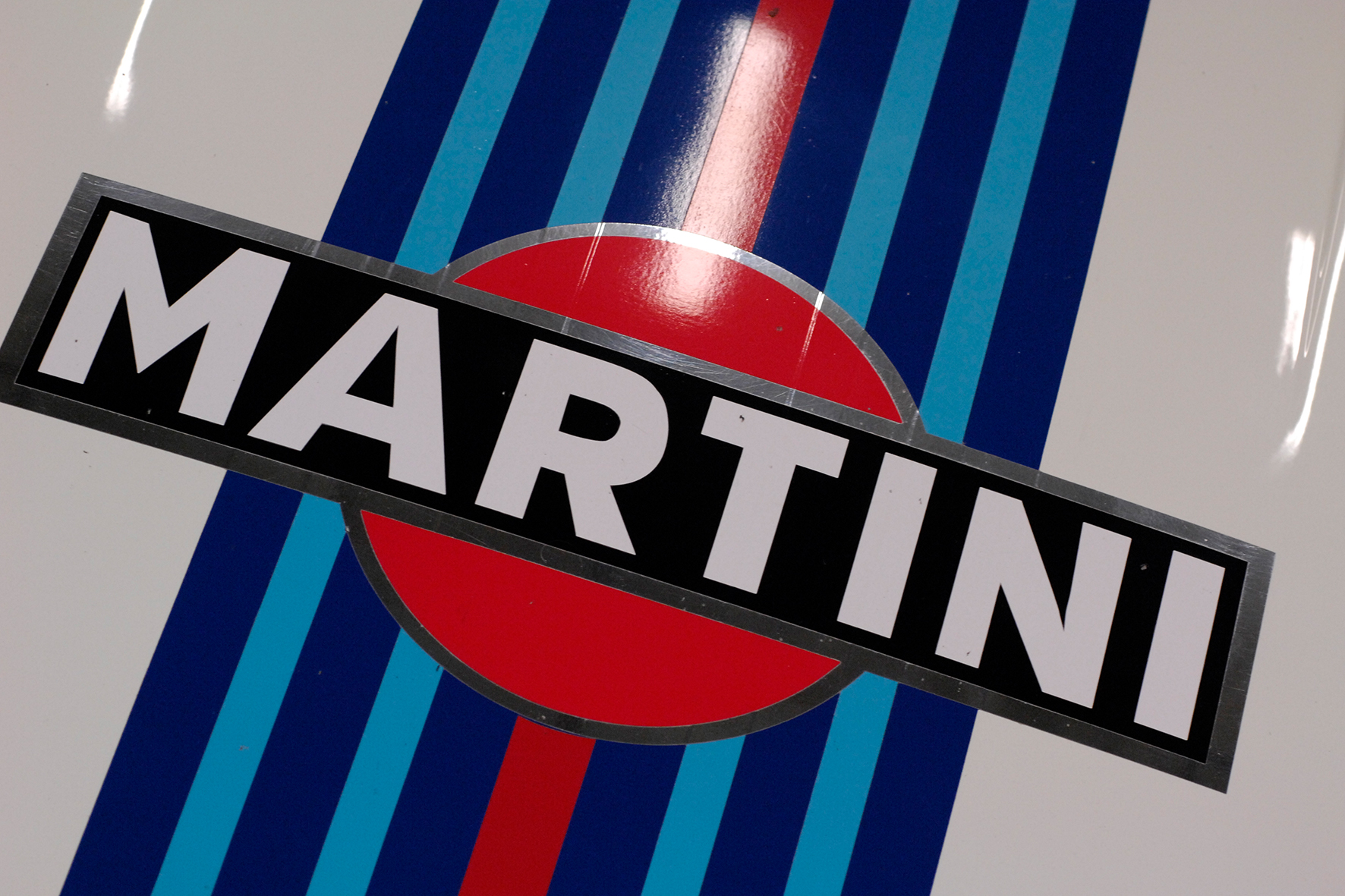
There are iconic paint finishes such as the light blue Porsche 917 with Gulf stickers, the black and gold Lotus F1 racing car with John Player’s logo, or the red and white Marlboro McLaren. Most of the time, of course, typography was needed to convey the message. Sometimes, however, colored stripes were enough, such as dark blue, light blue and red for Martini or the red and white triangle for Marlboro.
All in all, I like the purist design of the racing cars before advertising played that big role, but I think there are also fantastically designed examples from more recent times.

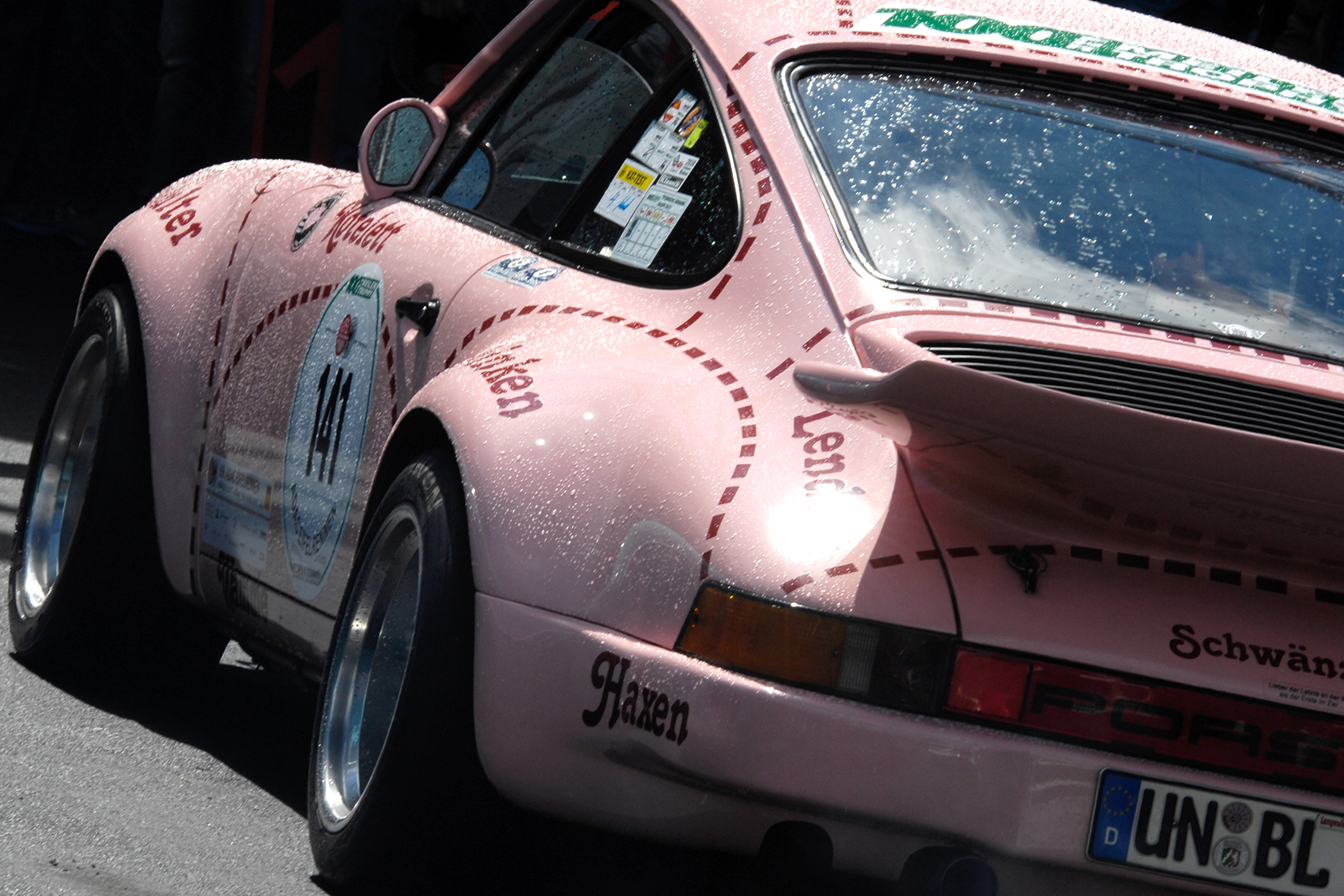
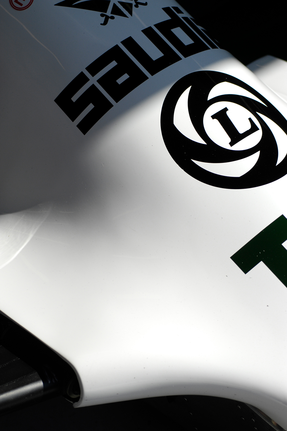
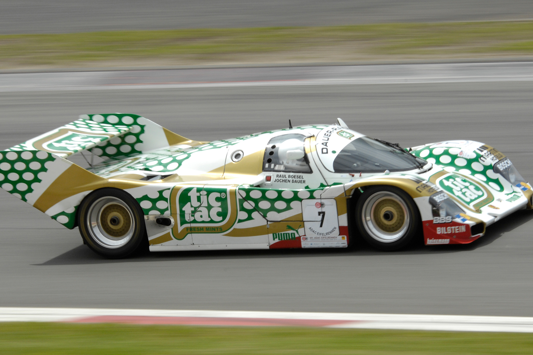
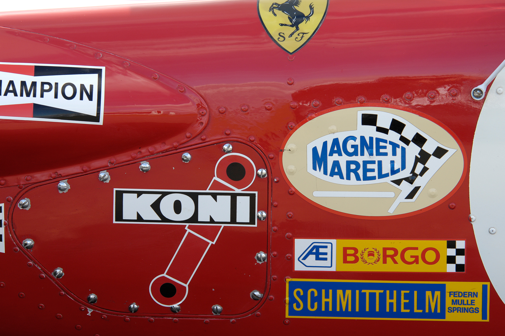
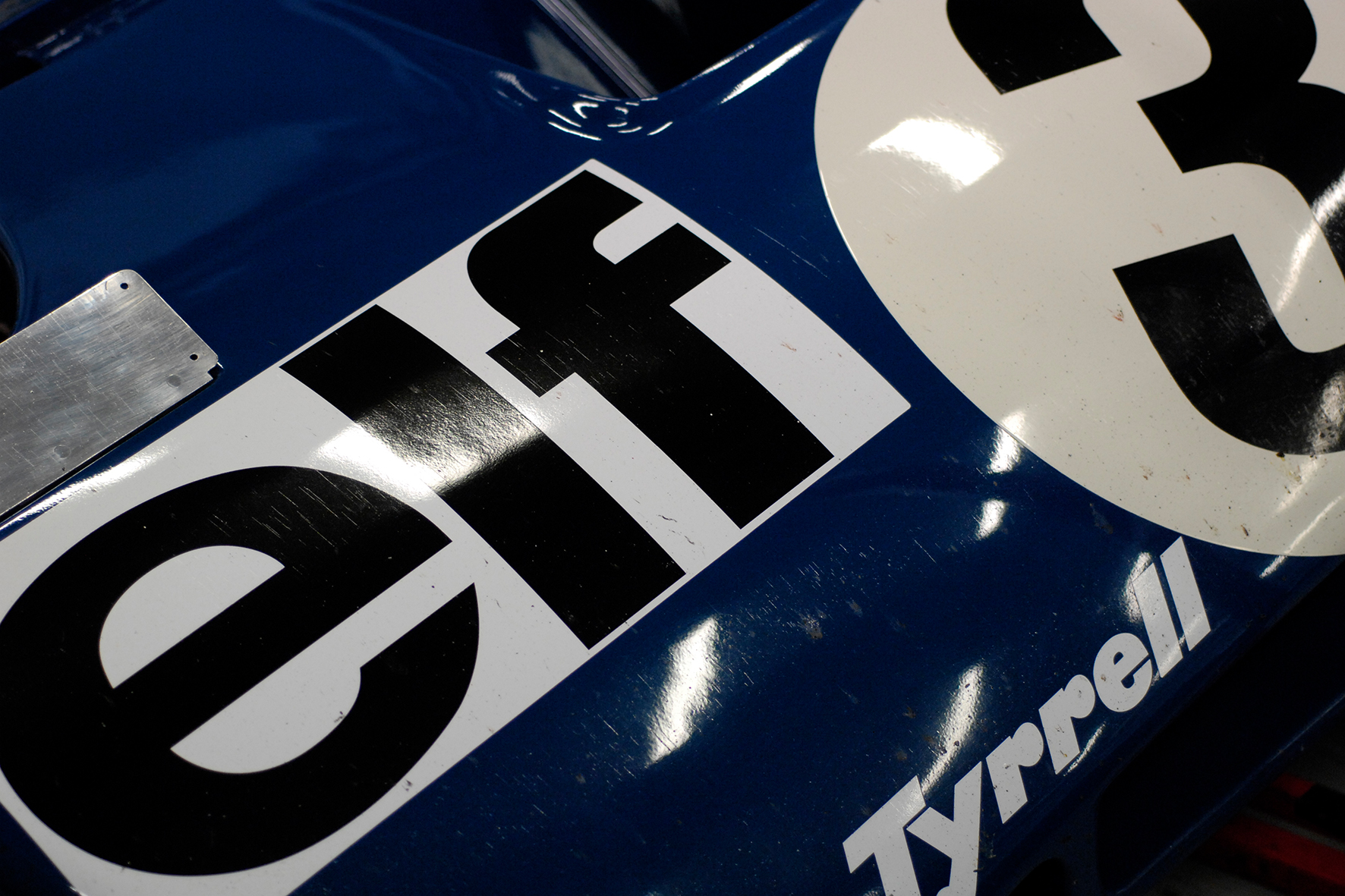
Here you can see a small selection of different periods in the history of the typographic representation of advertising messages on racing cars. Have fun with the photographs. Find out more about our photographer Ralph Lüker.
